
Widget Setup
In ZoriCRM, a widget is configured inside an embed. Each embed can have only one widget.
The widget is displayed on the website pages where the embed script is installed. If you want the widget to appear on all pages of your website, add the embed script to the main website template.
In this article, we will cover:
- how to enable a widget;
- how to configure a widget for one form;
- how to configure a widget for multiple forms;
- which settings can be changed.
Before you start
Before setting up a widget, make sure that:
- you already have at least one form;
- you already have an embed, or created one when publishing the form;
- the forms you want to use have been added to that embed.
You can create a form as described in the article Installing a Form. If a form was created without publishing, you can later add it to an embed manually.
How the widget works
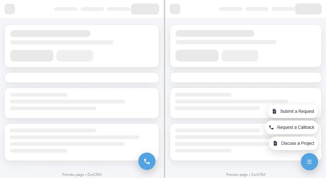
A widget is a button displayed over the website, in the bottom-right corner of the page.
Its behavior depends on how many forms are added to its list:
- if the widget has one form, clicking the widget opens that form immediately;
- if the widget has multiple forms, clicking the widget first opens a menu with the available forms, and then opens the selected form.
This allows you to use the widget both for a single simple scenario and for multiple scenarios on the same website.
Step 1. Open the embed you need
Go to Settings → Forms and Widgets, open the embed you want to use, or create a new one through Add → Embed.
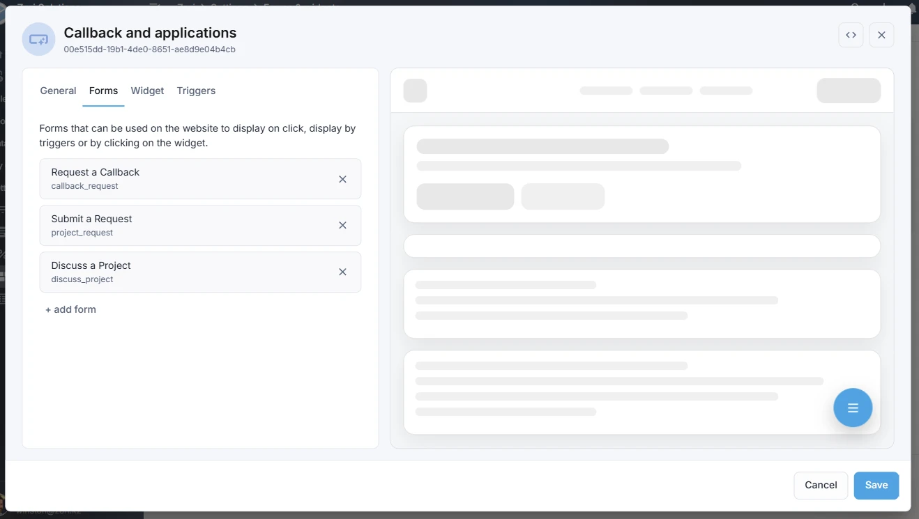
Make sure the embed card contains the forms you want to make available to your website visitors through the widget. If not, add them on the Forms tab.
On the Widget tab, you can only select forms that have already been added to the embed on the Forms tab.
Step 2. Enable the widget
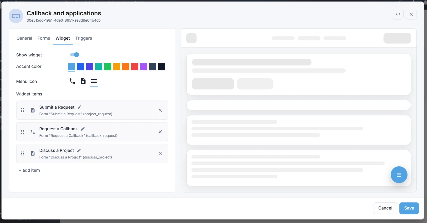
Open the Widget tab and enable Show widget.
Once this option is enabled, the widget settings become available.
On this tab, you can:
- enable or disable the widget;
- choose which forms will be available through the widget;
- set the accent color;
- configure the widget icon;
- change the order of forms in the menu;
- set the names and icons of menu items.
Widget with one form
This is the simplest and most common setup.
If only one form is added to the widget, clicking the widget opens that form immediately on the website.
In this case:
- no selection menu is shown;
- the form icon is used as the widget icon;
- the Menu icon setting is hidden.
This setup works well if your website needs one main contact option, for example:
- request a callback;
- submit an inquiry;
- contact your company.
What you can configure
For a widget with one form, it is usually enough to:
- select the form itself;
- set the accent color;
- check the form icon that will be used as the widget icon.
If the form opens immediately after clicking the widget, without an intermediate menu, that means the widget is configured for one form.
Widget with multiple forms
If multiple forms are added to the widget, it works as a button with a menu.
When the visitor clicks the widget, they first see a list of available forms. After selecting one of them, the corresponding form opens.
This setup is useful if you want to offer visitors several contact options, for example:
- request a callback;
- submit an inquiry;
- ask a question;
- book a consultation.
What you can configure
For a widget with multiple forms, you can configure:
- the list of forms shown in the menu;
- the order of forms in the menu;
- the name of each menu item;
- the icon of each menu item;
- the Menu icon - a separate icon for the widget button itself;
- the widget accent color.
When the widget contains multiple forms, the Menu icon setting is shown separately and controls the widget button itself, not the individual menu items.
Accent color
The accent color defines the main color of the widget on the website.
It is usually best to choose a color that matches your website design while still remaining clearly visible on the page.
A good accent color should:
- stand out from the website background;
- be noticeable to visitors;
- fit your company branding.
If the widget is not visually noticeable, visitors may simply ignore it.
Forms in the widget
The list of forms used by the widget is configured separately.
It is important to understand that:
- forms must first be added to the embed on the Forms tab;
- only then can they be selected on the Widget tab;
- the widget does not have to include all forms from the embed.
This is useful when one embed is used for several forms, but you only want some of them to be available through the widget.
For example, one form may be shown by timer, while another is only available through the widget.
Icons and names
For forms inside the widget, you can configure:
- the menu item name;
- the menu item icon.
If the widget contains one form, that form’s icon becomes the widget icon.
If the widget contains multiple forms, a separate Menu icon setting appears. It controls the widget button itself, while the form icons are used only inside the menu.
This helps make the widget clearer and easier to use for website visitors.
What cannot be changed right now
At the moment, some widget parameters are fixed.
Currently, you cannot:
change the widget position on the page; move it to another corner; choose a custom placement.
By default, the widget is displayed in the bottom-right corner of the page with a small offset.